Summary
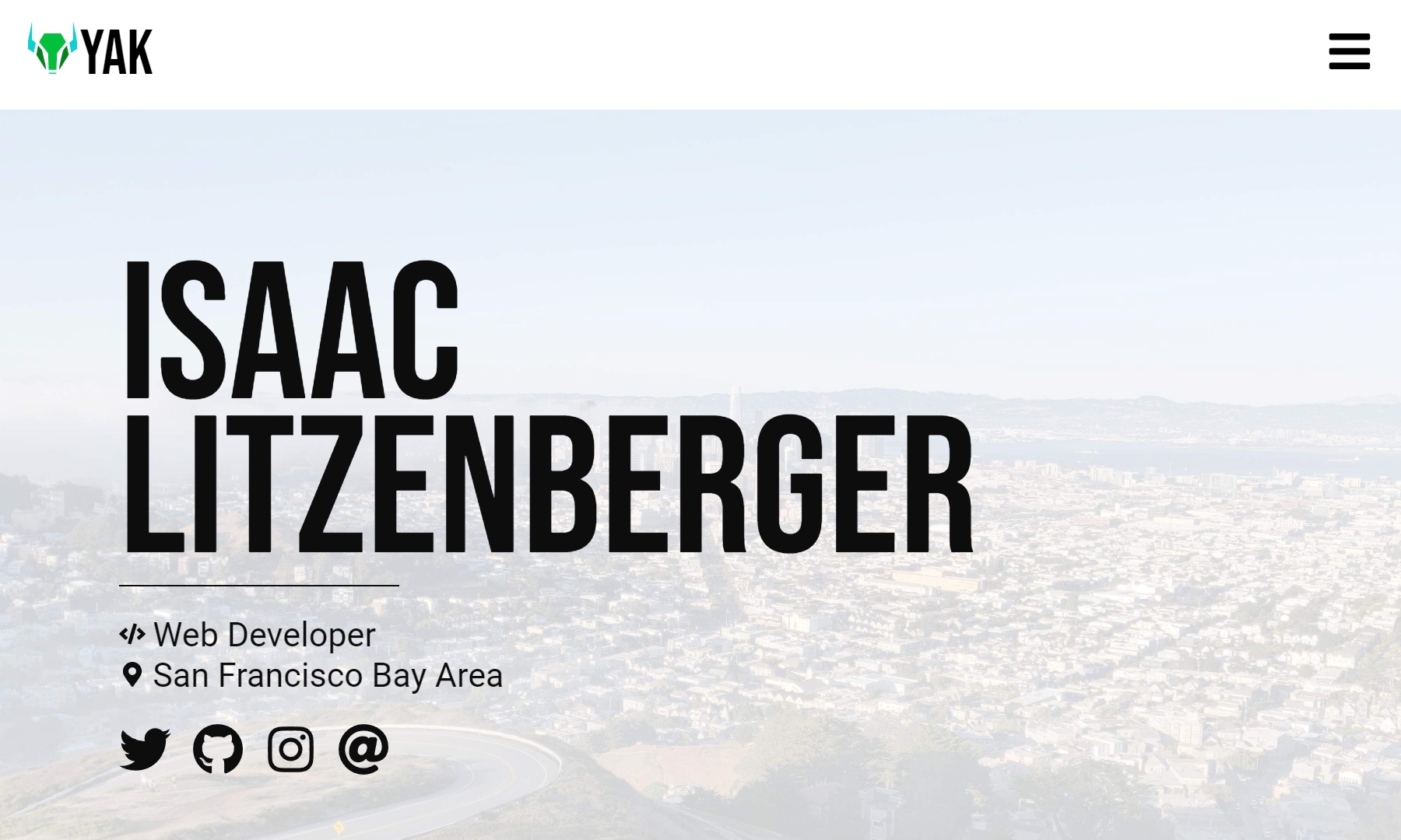
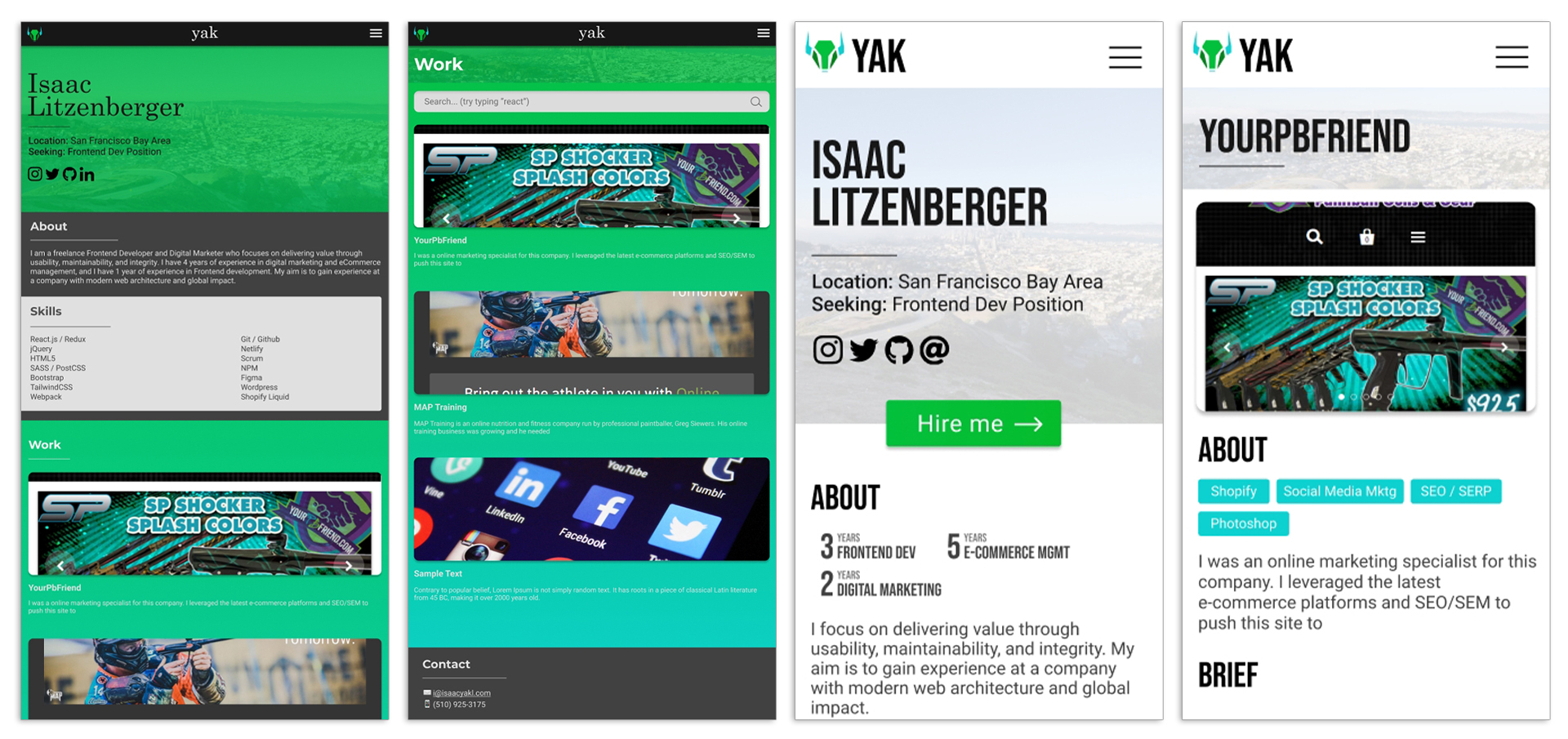
This is my personal website, built using NextJS and written in TypeScript. It features my portfolio, contact info, blog, social media links, and a web-based résumé. My site experiments with using CSS relative viewport units for element sizing and layouts instead of media queries and breakpoints, meaning it has a single layout.
Skills & tools used
Features
Below are many of the features I have developed for my website:
- Portfolio work and projects
- Web résumé
- Work search and tagging system with URL query support
- Linktree style "more" page
- Blog
- Sitemap generator
- Landing pages
Prototyping
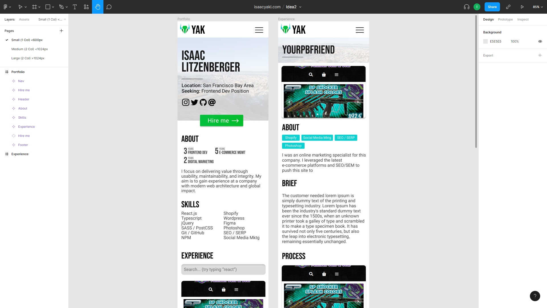
Because I had not revised my personal website in years, I started generating ideas. I first came up with some concepts on paper before moving two of the best ideas to Figma, where I could test them with multiple screen sizes. Eventually, I moved forward with the second, more professional-looking one. Of course, the end result had some changes after testing and feedback.
Viewport units and a single layout
When designing this website, I wanted to see if it was possible to make a website without media queries and breakpoints. I essentially wanted to make a website which had only a single layout. My solution: CSS relative viewport units — vw, vh, vmin, and vmax.
For a couple of reasons, I wasn't sure it would be possible. It meant finding element sizes that worked for all screen dimensions; that the website would have a persistent hamburger menu; and that desktop browsers would not be able to zoom-in. However, after much testing, I found it was possible, and the simplicity of the design made it ideal for my use case.
All of the element sizing is based upon the body's font-size, which is a vmax unit. As the window size changes, the body font size changes as well, and all elements in turn. This is by design due to my use of rem, em, and other relative units. Whenever elements need to reflow (say from 2 columns to 1 column) on small displays, I use max-width and display:flex.
I think it turned out pretty nicely, and the few downsides can still be addressed with solutions in the future (I have ideas). Let me know what you think.
Take your business to the next level!Discover new solutions and strategies.